Since we released our report on sources of personal income in 2012, I’ve gotten a lot of questions and comments on pension and retirement income, specifically. This category of income is often weirdly overlooked or forgotten, so I’m glad to comment on it further.
One thing I wanted to underscore is just how much pensions and IRAs are a middle-class phenomenon in this country. I touched on this in my report when I showed that tax filers earning $50,000 to $100,000 in a year – in other words, pretty ordinary Americans – are most reliant on retirement income of all of the income classes.
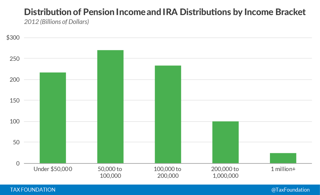
But let’s look at it another way. Of all of the pension and IRA income in the U.S. (in total, there was $843 billion of it on taxA tax is a mandatory payment or charge collected by local, state, and national governments from individuals or businesses to cover the costs of general government services, goods, and activities. forms in 2012) how much of it accrues to different income classes?

Here are the results, again using the same source (IRS Statistics of Income) that I’ve used previously. This chart includes all private-sector retirement savings vehicles, but not social security. Once again, the middle class really stands out.
I’m very aware of the limitations of sorting people into precise income buckets, and the complex interactions between life cycle effects and income data. So to some degree, this simple distributional table doesn’t tell a lot of the story.
But there’s an important fact here: the majority of private-sector retirement income ($485 billion out of the $843 billion) goes to people making less than $100,000 a year. In other words, it goes to everyday people. If you count people making less than $200,000 a year as middle class as well, then $717 billion of the $843 billion goes to everyday retirees.
I’m wary when other think tanks make vague noises about how the private sector retirement system needs to be taxed more heavily. It doesn’t; it’s taxed in a fair way at ordinary rates at the point that the income actually hits the pocketbook of the retiree.
But if your biggest concerns are distributional concerns, rather than neutrality concerns, I’d look one more time at the chart above. The system looks, on paper, exactly like what it is supposed to be: a way for people to live well, but not extravagantly, in their retirement.
Share this article