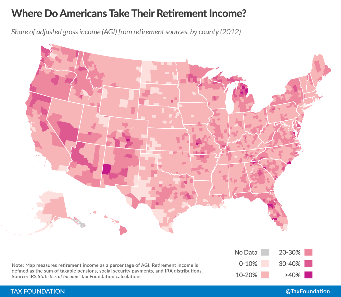
Americans tend to move in recognizable patterns as they age. This makes a great deal of sense; peoples’ needs when they are working are different from their needs in retirement. This map uses taxA tax is a mandatory payment or charge collected by local, state, and national governments from individuals or businesses to cover the costs of general government services, goods, and activities. data to help show where Americans rely the most – and the least – on retirement income. It does this by measuring percentage of adjusted gross incomeFor individuals, gross income is the total pre-tax earnings from wages, tips, investments, interest, and other forms of income and is also referred to as “gross pay.” For businesses, gross income is total revenue minus cost of goods sold and is also known as “gross profit” or “gross margin.” that comes from retirement sources in each county. Retirement income, for purposes of this map, is defined as taxable pensions, social security, and IRA distributions. This is an important source of income that broadly benefits the middle class.
In this particular case, county data seems more illuminating than state-level data. The characteristics of Miami-Dade County, for example, are substantially different from the characteristics of other counties farther up the Florida coast.
Some noticeable patterns emerge in the county-level data. First, Florida’s overall reputation as a destination for retirees is entirely grounded in the facts. Sumter County, an inland area west of Orlando, reports more of its income from retirement sources than any other county in the country, and it’s not particularly close. This is unsurprising, as the census has often measured it as having the oldest average population.
Top Ten Counties for Retirement Income, 2012
|
County |
Percentage of Income from Retirement Sources |
|
Sumter County, FL |
45.6% |
|
Roscommon County, MI |
35.1% |
|
Charlotte County, FL |
33.8% |
|
Citrus County, FL |
33.2% |
|
Brunswick County, NC |
32.5% |
|
Iosco County, MI |
32.1% |
|
Polk County, TX |
31.4% |
|
Transylvania County, NC |
31.1% |
|
Jefferson County, WA |
31.0% |
|
Cumberland County, TN |
30.8% |
(In counties with a minimum of 10,000 tax returns)
This list, which looks only at places with at least 10,000 tax returns, excludes smaller rural counties, like Alcona County, Michigan (40.3%). Individually, these don’t contain too many retirees, but collectively, they are significant. Rural counties generally, and those of northern Michigan, especially, tend to be favored retirement destinations.
The most interesting thing about this data, though, might be the other end of the spectrum: the places least geared towards retirement income.
Ten Counties With Least Income from Retirement Sources, 2012
|
County |
Percentage of Income from Retirement Sources |
|
Williams County, ND |
3.0% |
|
New York County, NY |
4.1% |
|
Teton County, WY |
4.1% |
|
Stark County, ND |
4.4% |
|
Midland County, TX |
4.7% |
|
Maverick County, TX |
5.0% |
|
Hudson County, NJ |
5.1% |
|
San Francisco County, CA |
5.1% |
|
Starr County, TX |
5.1% |
|
Suffolk County, MA |
5.7% |
(In counties with a minimum of 10,000 tax returns)
The counties with the least income coming from retirement sources fall in two rough categories. The first of these categories is those counties at the heart of expensive urban areas. Retirees eschew the downtown areas of New York, San Francisco, and Boston. Cost of living is no doubt a substantial concern here.
But the second of these categories is entirely distinct: retirees also, for entirely different reasons, have no interest in the resource extraction economies of Midland, Texas, or Williston, North Dakota. These are good places for people who want to work hard labor, but they are perhaps less ideal for comfortable living.
While all ten of the counties above are significant and play important roles in our economy, they are not well-suited for the needs of retirees. What is interesting about this map, in other words, is that counties that stand out by many economic metrics don’t stand out here.
Follow Alan, Rich, and Tom on twitter.
Share this article